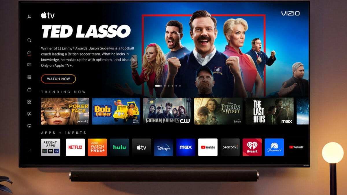
Vizio Rolls Out New Home Screen That Resembles Streaming Service Menus

Vizio TV users, your home screen is about to change. But the new look should be familiar to anyone who’s used streaming services recently, since the format is similar. You’ll see promoted shows and auto-playing video up top, navigation icons on the left, and content recommendations below that.
The enhanced Vizio home screen will begin rolling out to most Vizio Smart TVs from the 2016 model year and later in the coming weeks, a Vizio spokesperson told CNET in an email.
The new home screen is meant to improve users’ abilities to discover, navigate, personalize and stream content. There are revamped menus, settings and navigation features, and a redesigned virtual keyboard and genre pages.
Read more: Best TV for 2023: We Tested Samsung, LG, TCL, Vizio and More
You can now find the show or movie you want directly from the home screen, and personalize the row of apps with your favorites. Movies and shows from different apps and services will all be centralized in the same spot. The home screen also features built-in Rotten Tomatoes scores and Common Sense Media parental guidance.
“The Vizio home screen is the next step in our evolution to bring our consumers the best entertainment experience. Our goal is to make it easy for our consumers to experience our latest innovations as soon as they are available, even on older Vizio smart TVs,” said Vizio vice president Kaitlyn Collins in a statement. “The rollout and availability of the new Vizio home screen is another manifestation of the idea that, even after consumers purchase a TV from us, we’ll continue to offer value, support and innovation to their viewing experience.”
CNET has included Vizio in our roundup of the best budget TVs, and we named the Vizio V-Series our best budget 4K TV for picture quality.
2023’s Best TV and Streaming Shows You Can’t Miss on Netflix, HBO, Disney Plus and More
See all photos
Source: CNET


